Olumi Tecnologia works in electronic security and automation — CCTV, access control, alarms,
Wi-Fi networks, firewall/IP telephony, lighting and smart-home — a market dominated by generic
blue visuals. The brand needed an identity that conveyed security and sophistication, with a
system that worked from a 42px avatar up to building signage.
Process
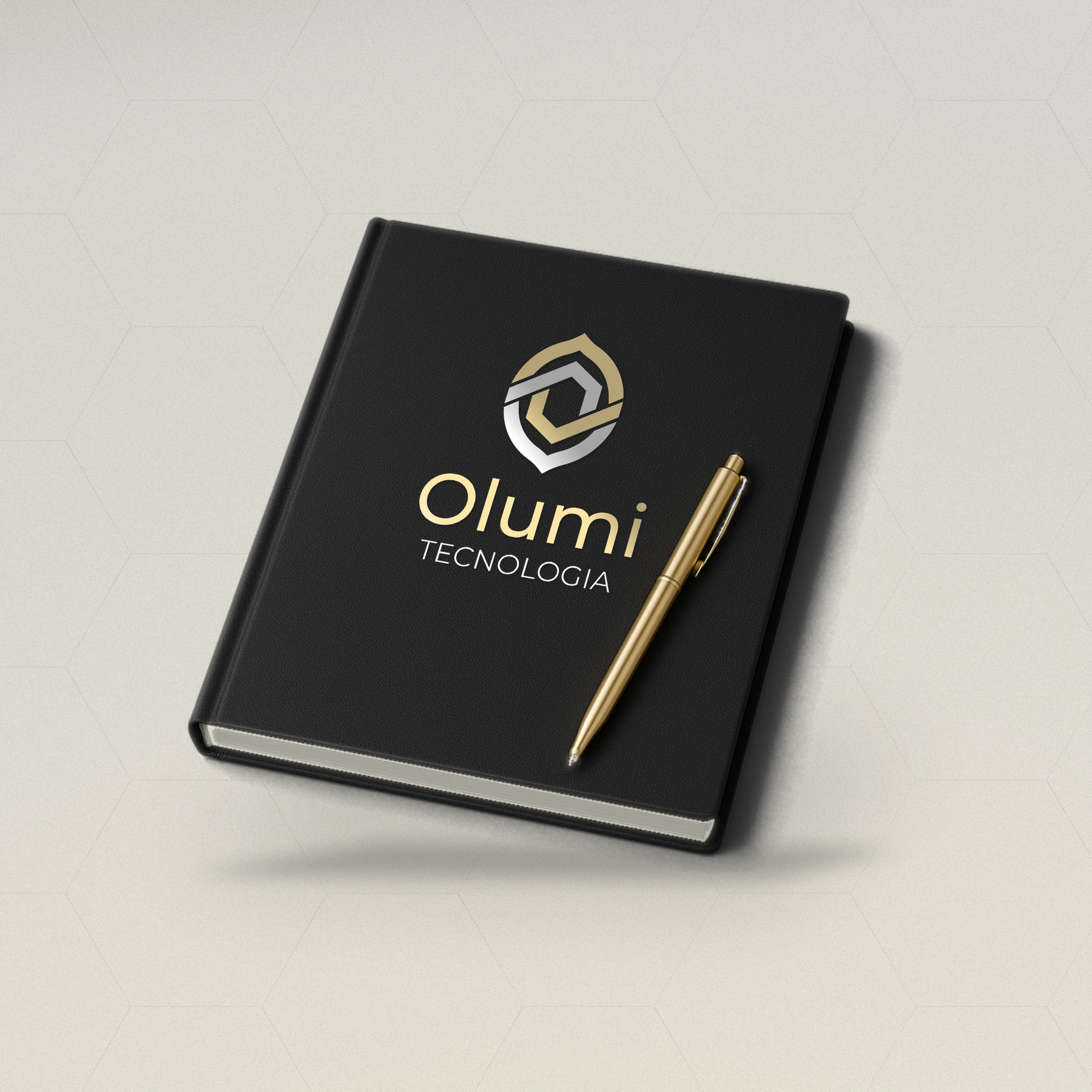
Symbol — a shield formed by two interlocking bands, champagne gold and gray over charcoal,
closing into a hexagon at the center: protection, connection and technology in a single form.
Palette — nearly monochrome, with gold as the only warm accent over dark charcoal.
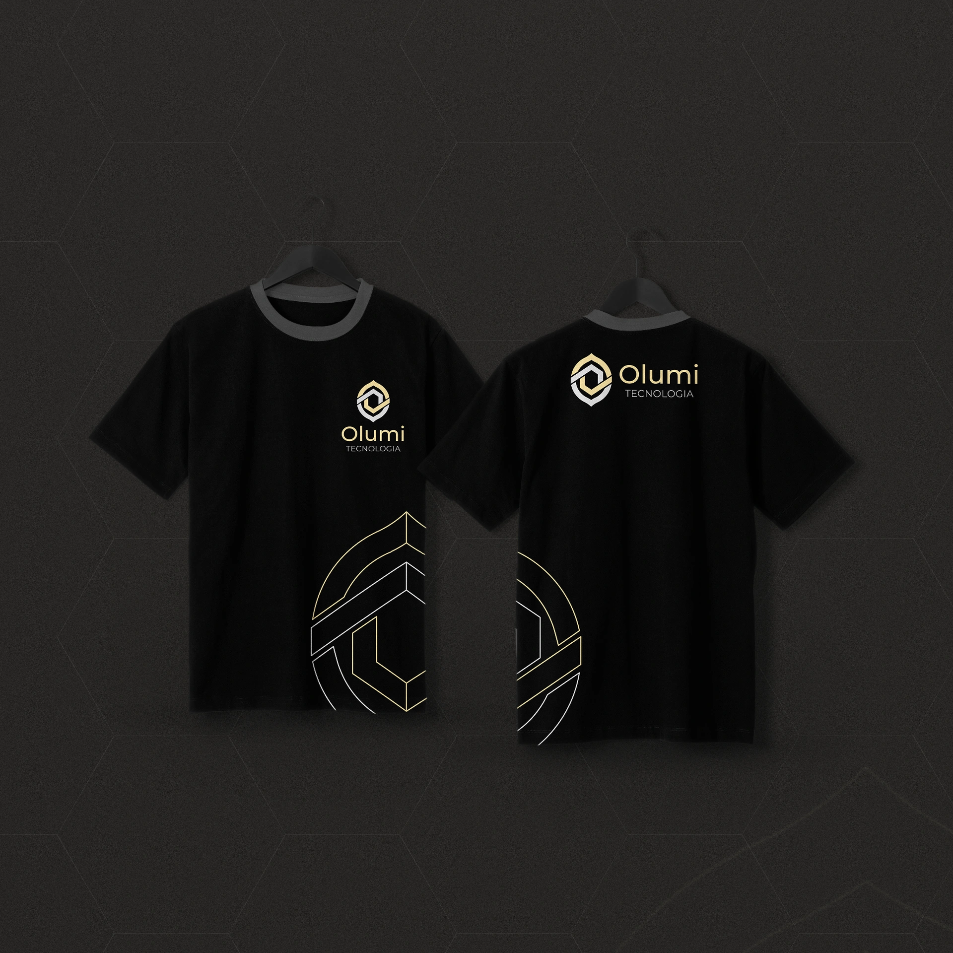
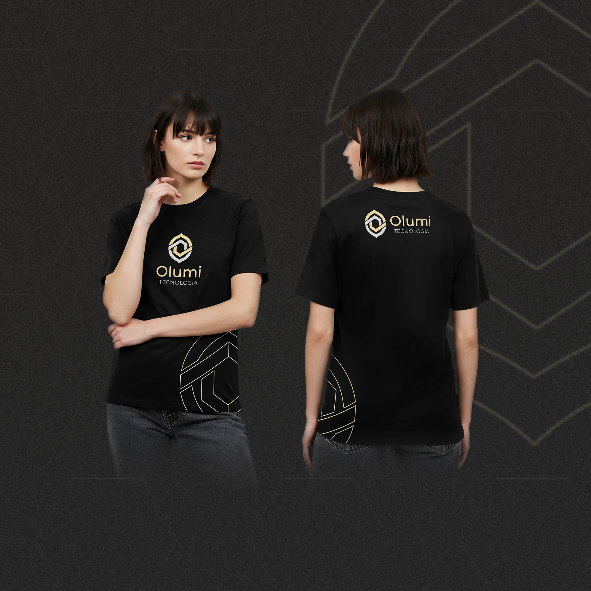
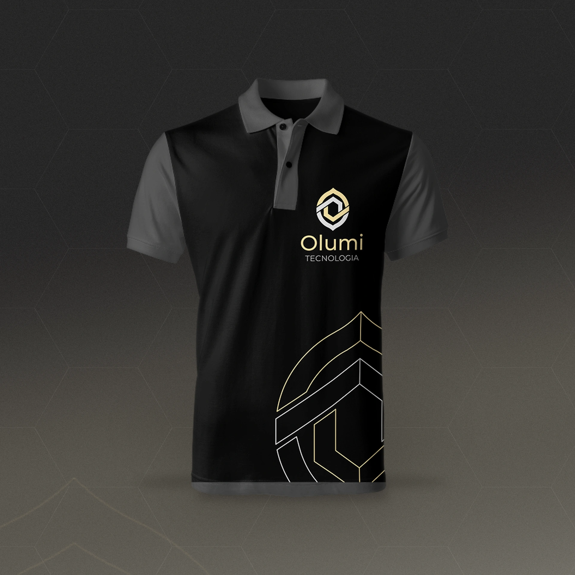
System — the symbol’s outline, enlarged into fine lines, becomes a recurring graphic
pattern; gold pills and rounded frames become interface components, ready for screens and digital pieces.
Applications — digital business cards with QR code (from minimal to full), email
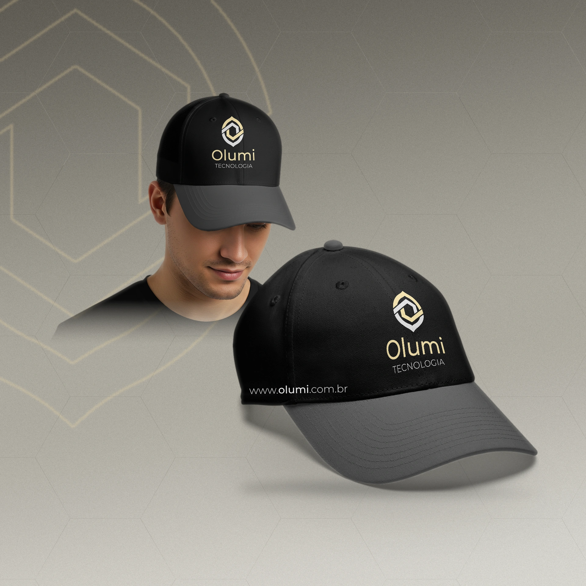
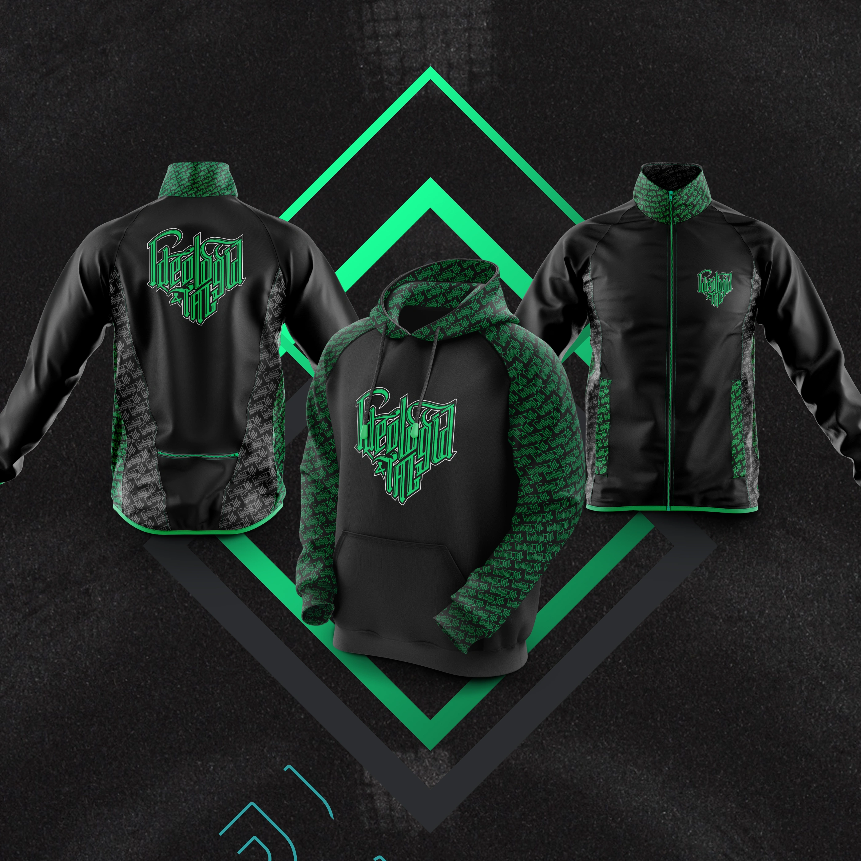
signature, social avatar, branded merchandise (label and pen) and apparel.
Result
A brand that breaks from the sector’s generic blue and stays consistent at any scale, from avatar
to apparel. Its component system lets Olumi create new pieces without losing coherence.

 OlumiABCDEFGHIJKLMNOPQRSTUVWXYZabcdefghijklmnopqrstuvwxyz0123456789
 PrecisionConnectionEvolution
 GOLDFBE4A4E8C875C9A355CHARCOAL2A29294A4847NEUTRALSD4D4D4F4F3F0