DNIT — Brazilian National Department of Transport Infrastructure
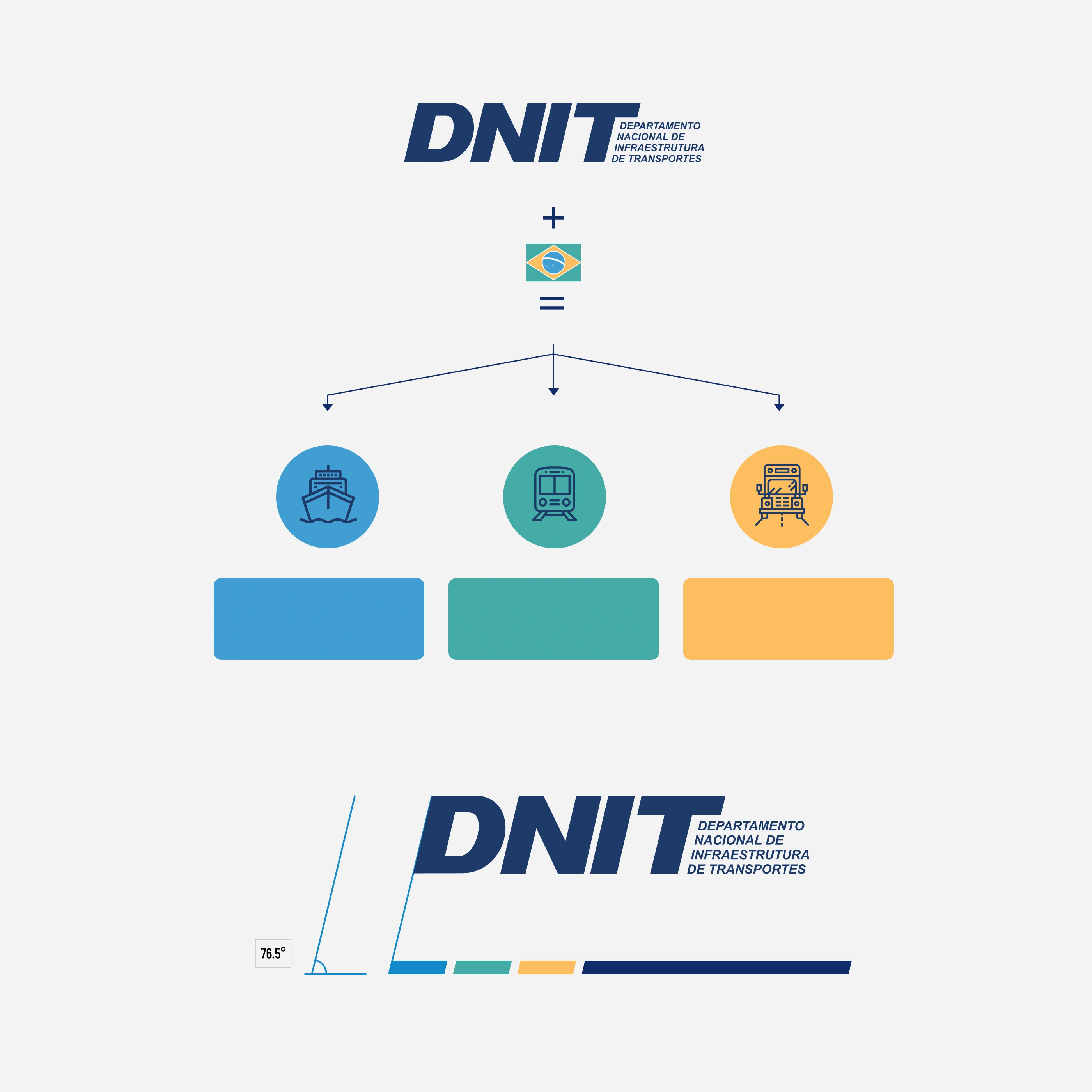
MARITIME TRANSPORTRAIL TRANSPORTROAD TRANSPORTHEXRGBCMYKPANTONE1D3A690 55 112100 80 0 40P 103 -16 C0087CC20 136 20280 35 0 0P 109-7 C45ABA569 171 16570 10 40 0P 124-13 CFBBE5E251 190 940 30 70 0P 17-6 CMARITIME
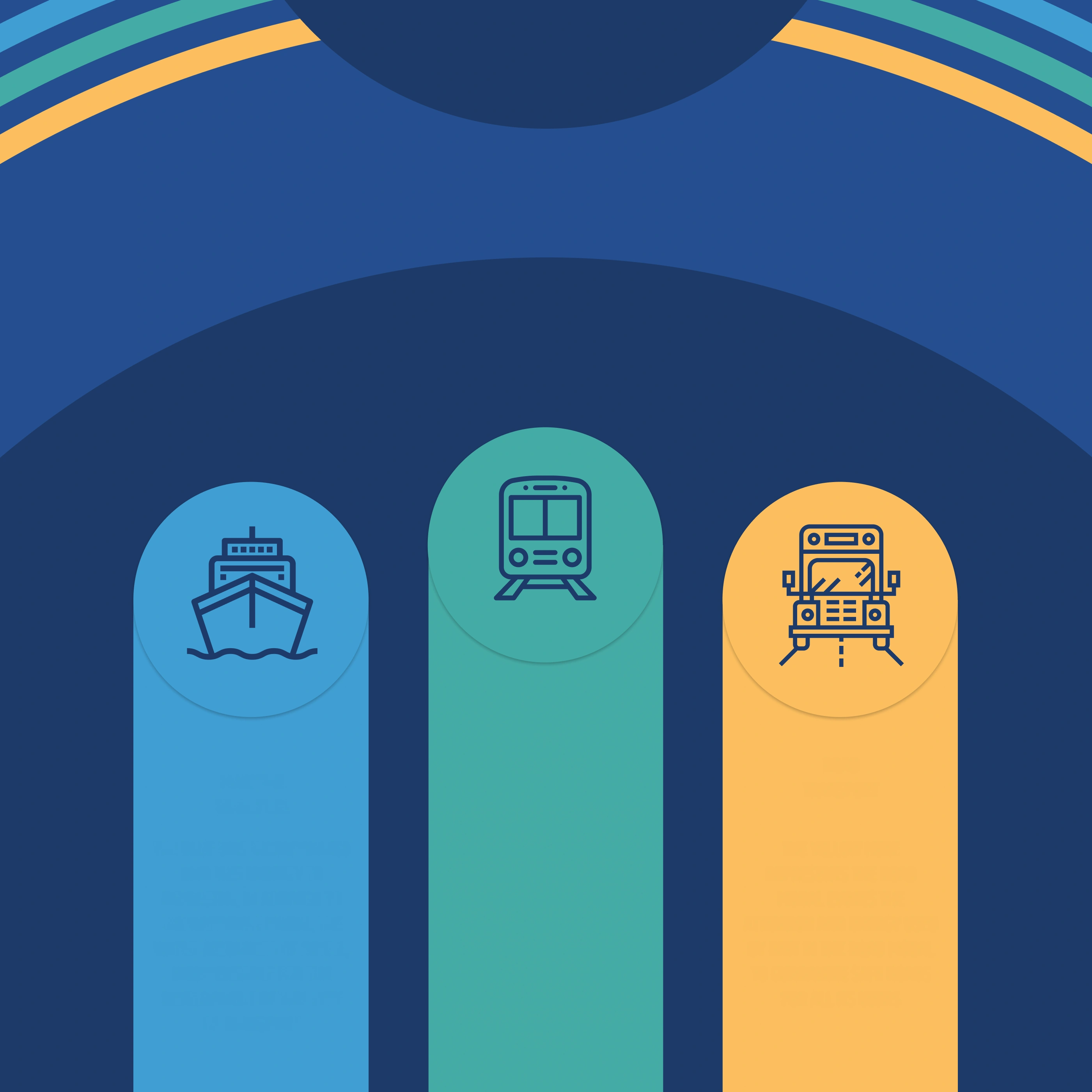
TRANSPORTTHE BLUE WAS INCORPORATED
INTO THIS IDENTITY TO
REPRESENT, IN ADDITION TO
THE WATERWAY MODAL, THE
WATER RESOURCES OF BRAZIL,
INDISPENSABLE FOR THE
DEVELOPMENT OF THIS TYPE
OF TRANSPORTRAIL
TRANSPORTGREEN COMES TO SYMBOLIZE
THE RAIL MODAL, YOUR CHOICE
HIGHLIGHTS THE SUSTAINABLE
CHARACTERISTICS OF THIS TYPE
OF TRANSPORT AS WELL AS
DNIT'S RESPONSIBILITY TO
COMPLY WITH
ENVIRONMENTAL
PRESERVATION LAWS IN ITS
PROJECTSROAD
TRANSPORTTHE YELLOW HERE
REPRESENTS THE ROAD
MODAL EVOKES THE
ATTENTION AND ENERGY USED
BY DNIT IN THE ROAD MODAL
TO GUARANTEE SAFE ROADS
FOR ALL ITS USERSEXPAND IN A FLUID, BUT SYSTEMATICALLY ORGANIZED WAY, CARRYING THE VALUES OF THE AUTARCHY IN A SUBTLE AND
HARMONIOUS REPRESENTATION THAT COULD CONVEY AN IDENTITY WITH THE BRAND'S PERSONALITYEXPAND IN A FLUID, BUT SYSTEMATICALLY ORGANIZED WAY, CARRYING THE VALUES OF THE AUTARCHY IN A SUBTLE AND HARMONIOUS
REPRESENTATION THAT COULD CONVEY AN IDENTITY WITH THE BRAND'S PERSONALITYSTAMP IN COMMEMORATION OF THE 18TH ANNIVERSARY OF THE AUTARCHYFROM THE NECESSITY OF AN IMAGE THAT COULD REPRESENT THE MODES OF TRANSPORT, ROAD, RAIL, AND
WATERWAY IN A SINGLE COMPOSITION, THIS IMAGE WAS DEVELOPED BY THE DESIGN TEAM TO FULFILL THIS
PURPOSE WITH IMAGE MANIPULATION TECHNIQUES.
Context
How do you represent roads, railways and waterways in a single brand, with the seriousness of a
public institution and a personality of its own? That was the challenge behind the identity of DNIT,
Brazil’s federal transport infrastructure agency. From 2015 to 2020, through Accenture, I led the
design team at the agency’s communications office (ASCOM). The visual identity was developed by me
and the team I headed at ASCOM.
Process
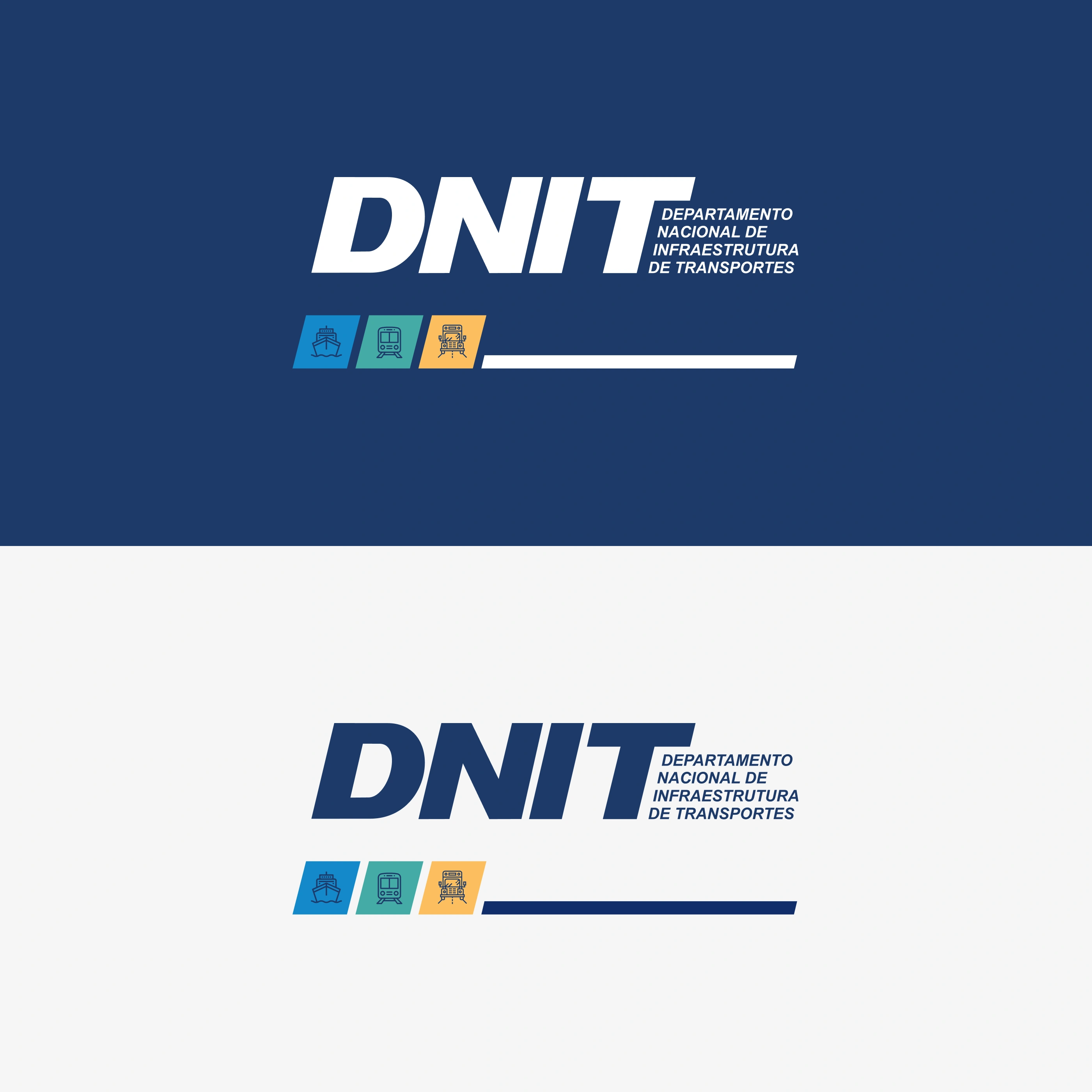
Concept — colored stripes grow out of the logotype and expand like roads: fluid, yet
organized as a system, carrying the agency’s values without losing its sobriety.
Meaningful color — each transport mode got its own color: blue stands for waterways
and Brazil’s water resources; green for rail and the commitment to environmental
preservation; yellow for roads, and the attention and energy put into keeping them safe.
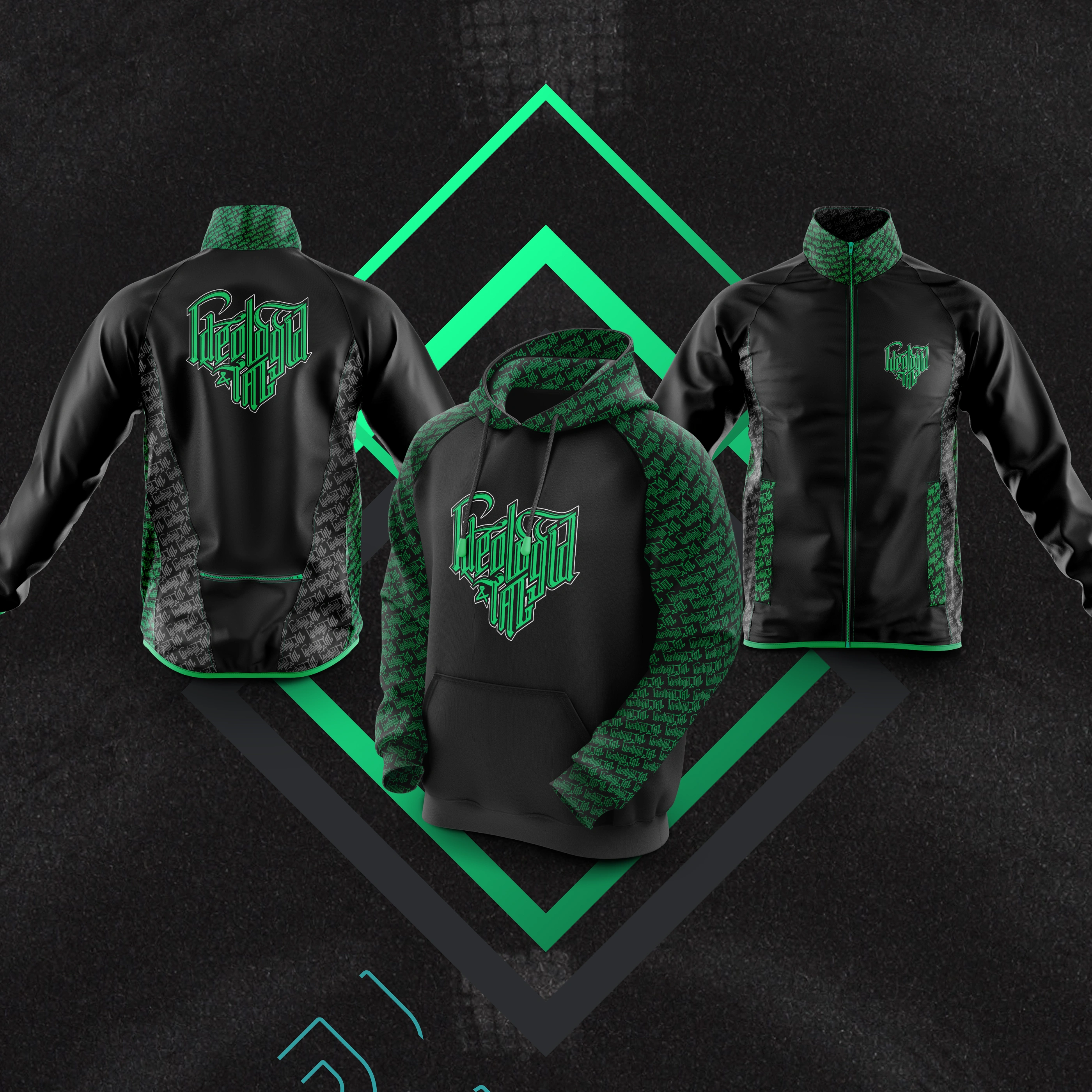
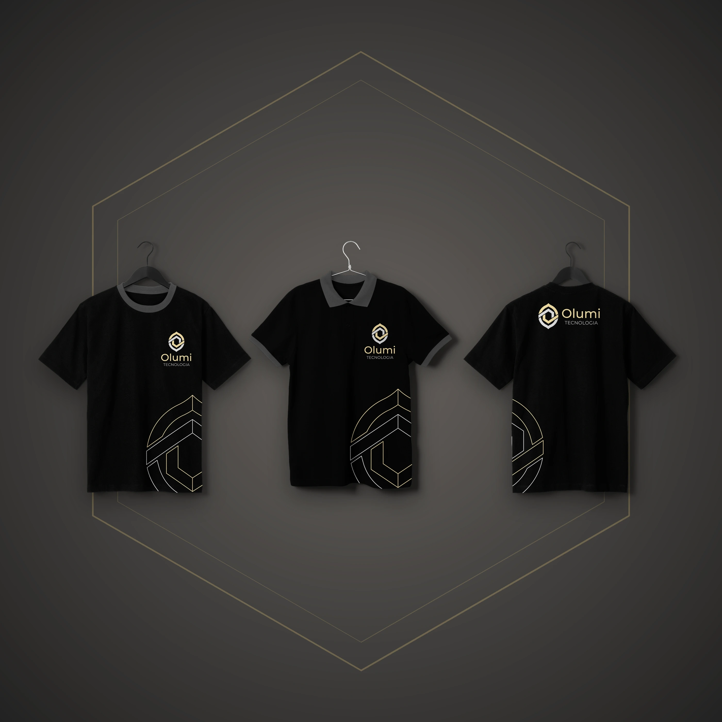
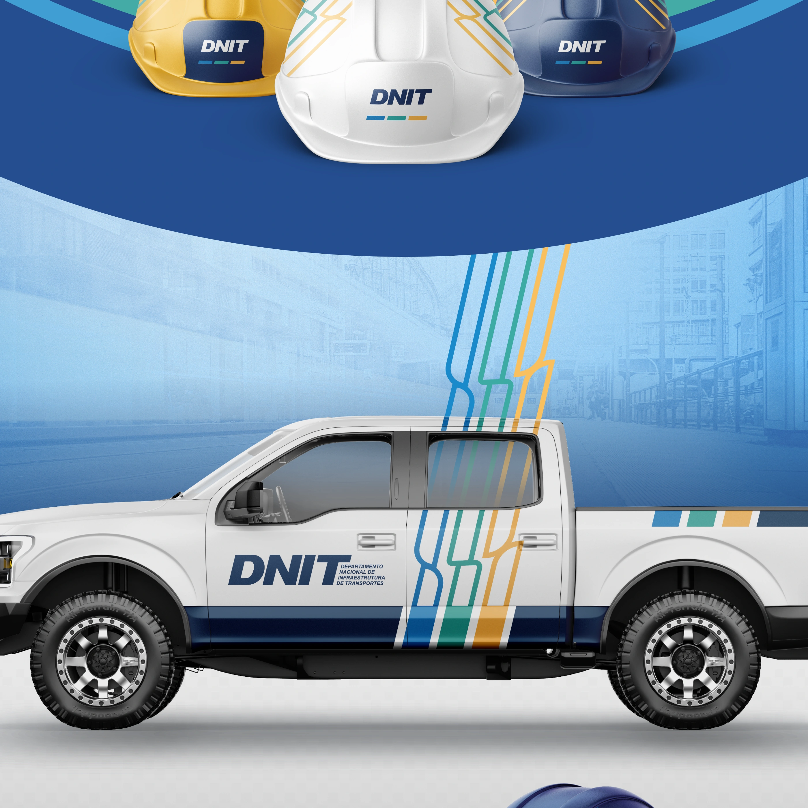
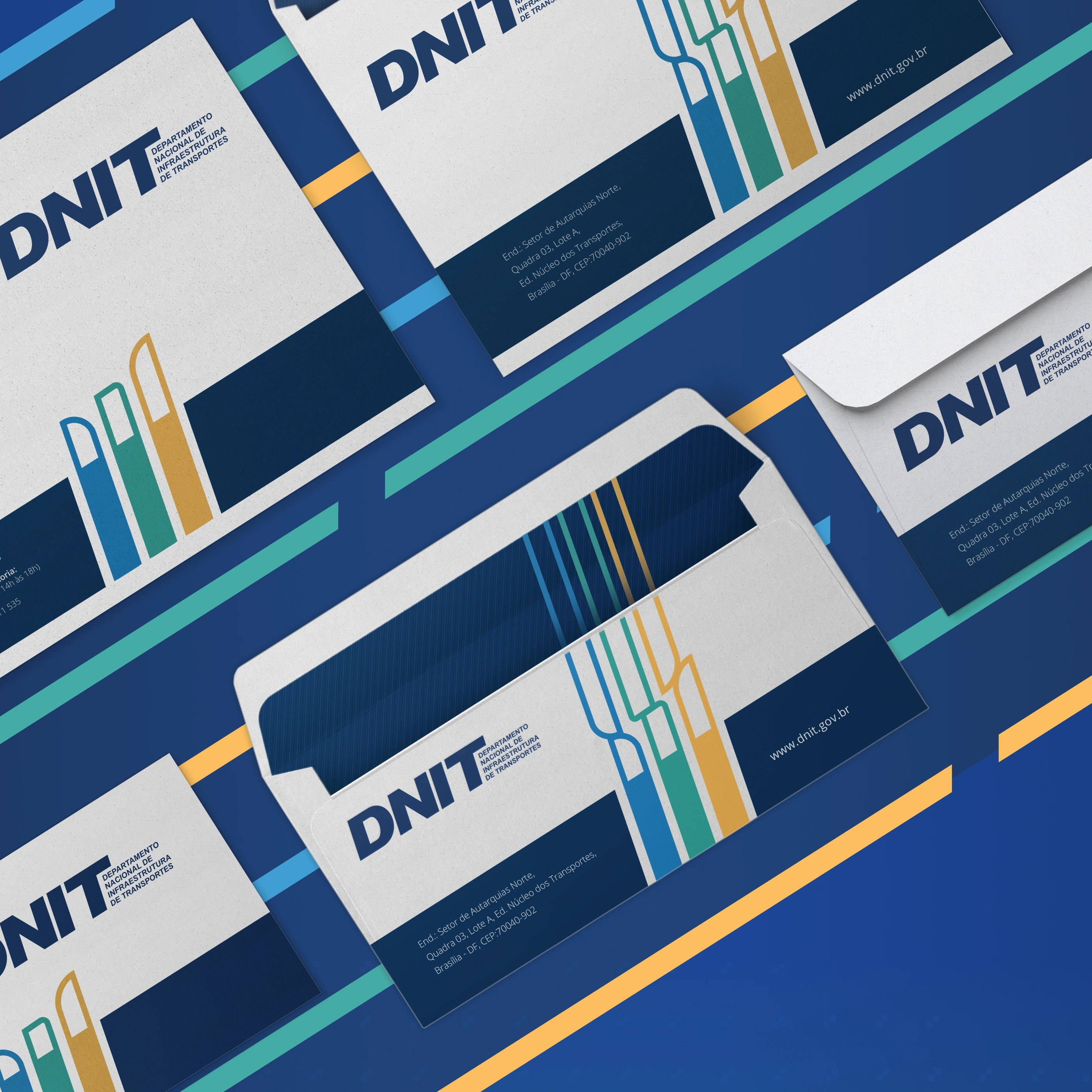
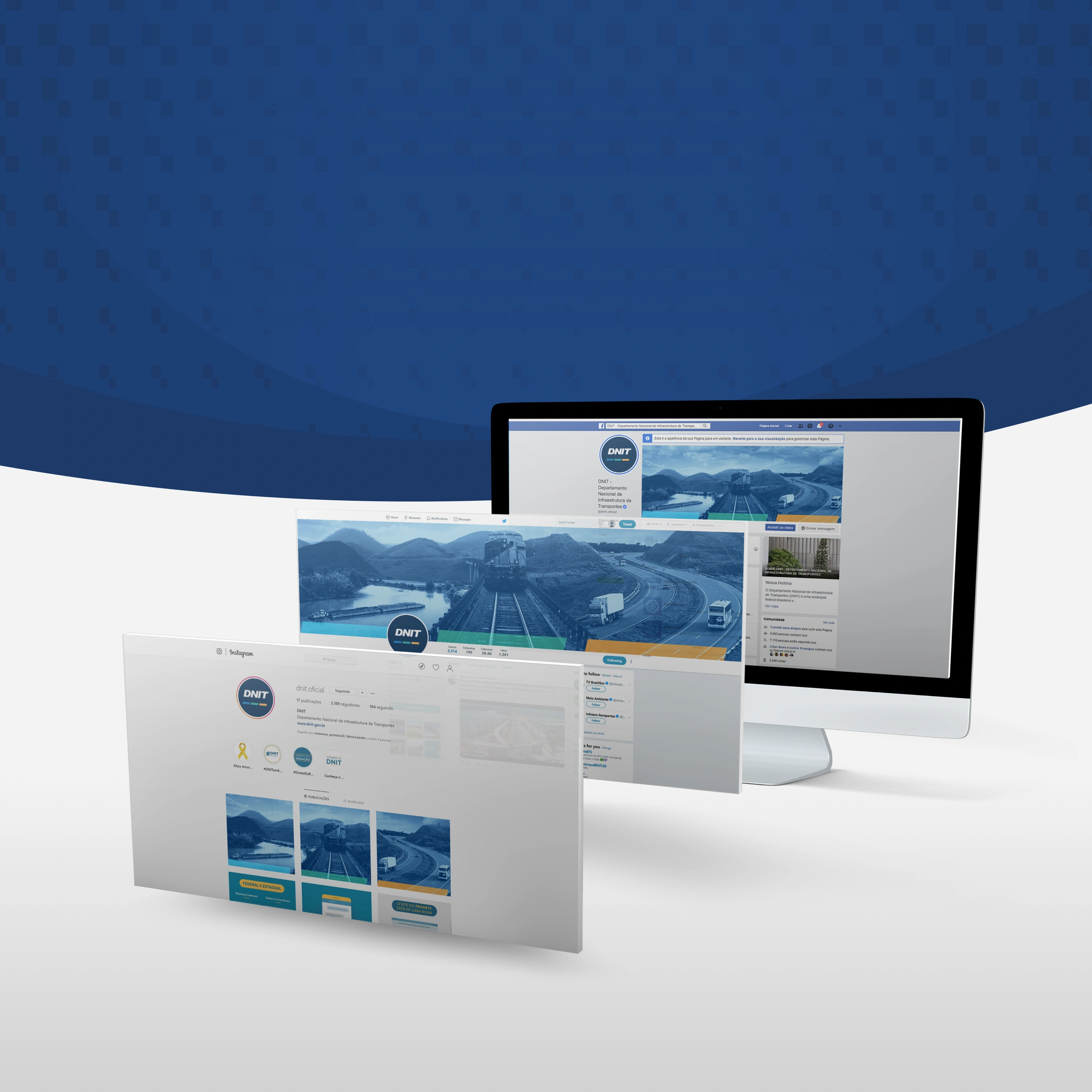
Application system — stationery, badges, uniforms, helmets, fleet, calendar and digital
presence, all built from the colored stripes that grow out of the logotype.
Key visual — a single composition bringing together road, rail and waterway, created with
image manipulation techniques for social media and the website.
Result
A cohesive identity system applied from stationery to fleet. The brand’s language even made it
onto a postage stamp: the commemorative stamp for the agency’s 18th anniversary, issued by Brazil’s
postal service (Correios).
 MARITIME TRANSPORTRAIL TRANSPORTROAD TRANSPORT
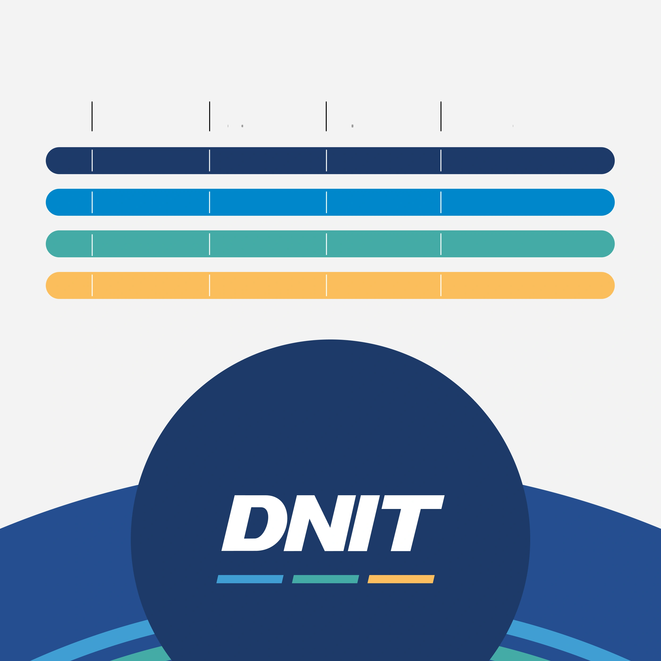 HEXRGBCMYKPANTONE1D3A690 55 112100 80 0 40P 103 -16 C0087CC20 136 20280 35 0 0P 109-7 C45ABA569 171 16570 10 40 0P 124-13 CFBBE5E251 190 940 30 70 0P 17-6 C
 MARITIME
TRANSPORTTHE BLUE WAS INCORPORATED
INTO THIS IDENTITY TO
REPRESENT, IN ADDITION TO
THE WATERWAY MODAL, THE
WATER RESOURCES OF BRAZIL,
INDISPENSABLE FOR THE
DEVELOPMENT OF THIS TYPE
OF TRANSPORTRAIL
TRANSPORTGREEN COMES TO SYMBOLIZE
THE RAIL MODAL, YOUR CHOICE
HIGHLIGHTS THE SUSTAINABLE
CHARACTERISTICS OF THIS TYPE
OF TRANSPORT AS WELL AS
DNIT'S RESPONSIBILITY TO
COMPLY WITH
ENVIRONMENTAL
PRESERVATION LAWS IN ITS
PROJECTSROAD
TRANSPORTTHE YELLOW HERE
REPRESENTS THE ROAD
MODAL EVOKES THE
ATTENTION AND ENERGY USED
BY DNIT IN THE ROAD MODAL
TO GUARANTEE SAFE ROADS
FOR ALL ITS USERS
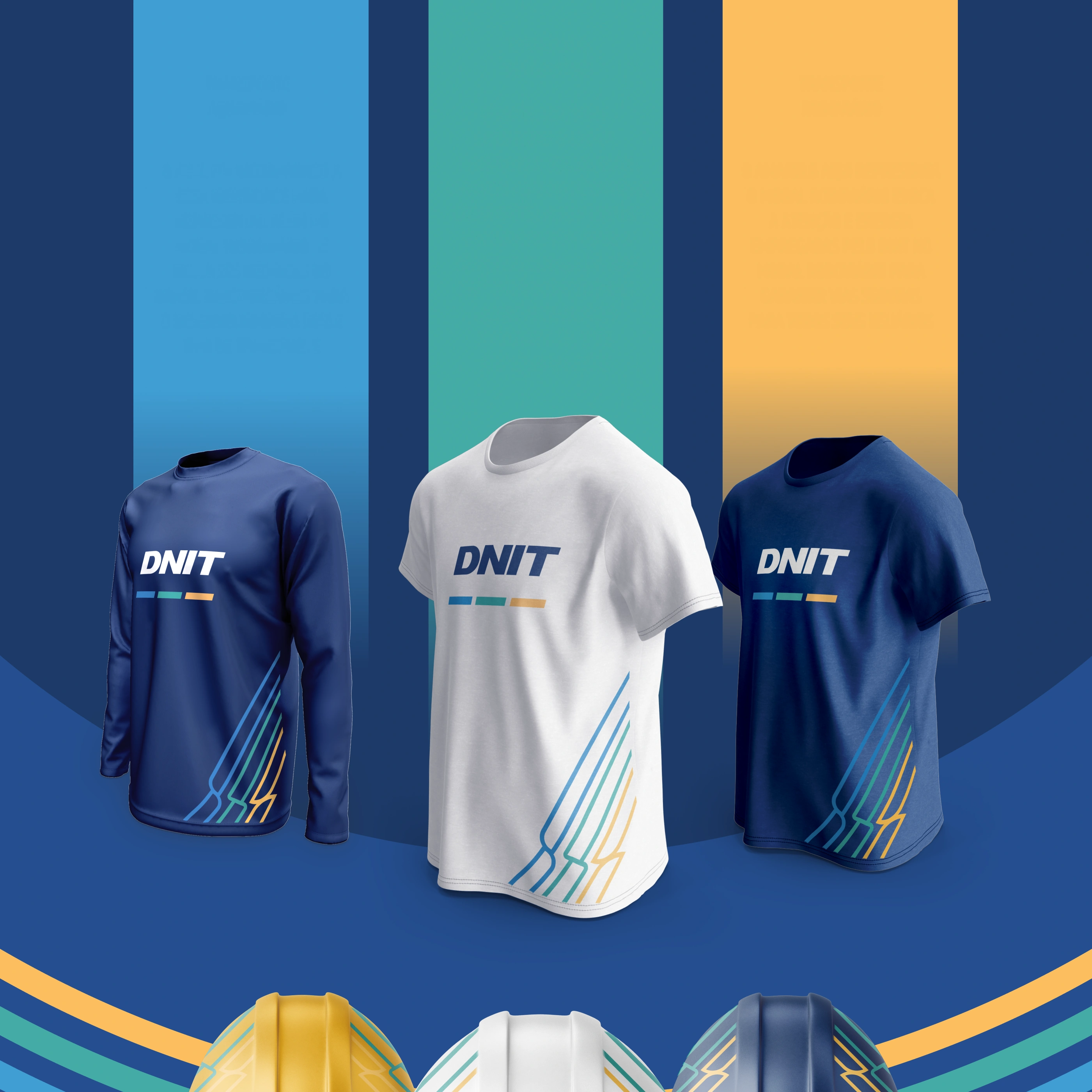
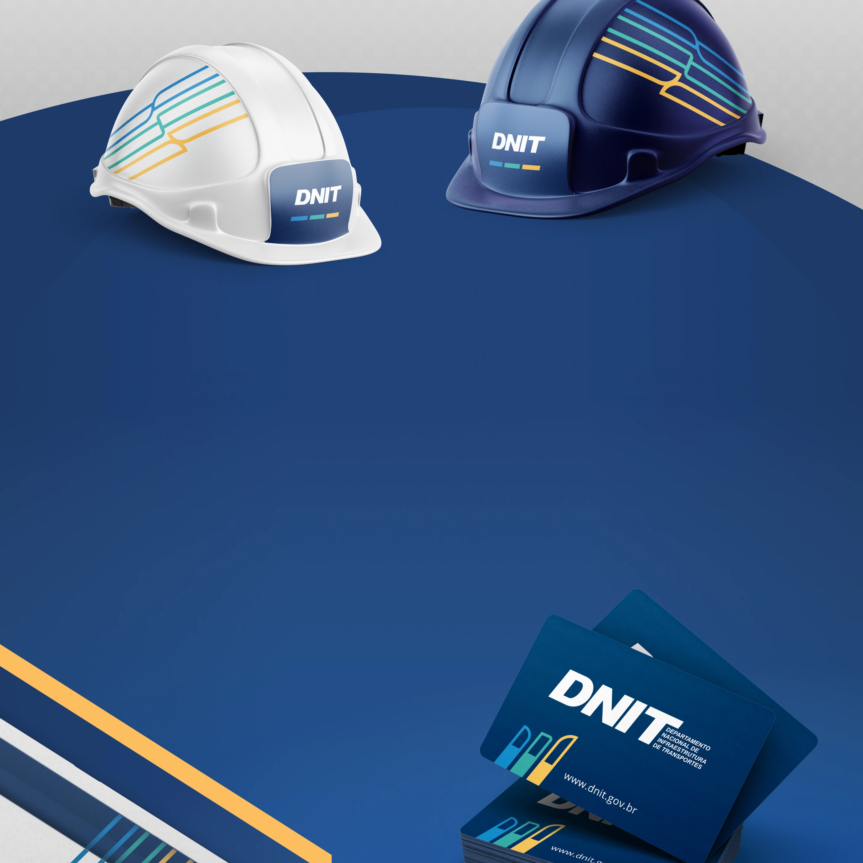 EXPAND IN A FLUID, BUT SYSTEMATICALLY ORGANIZED WAY, CARRYING THE VALUES OF THE AUTARCHY IN A SUBTLE AND
HARMONIOUS REPRESENTATION THAT COULD CONVEY AN IDENTITY WITH THE BRAND'S PERSONALITY
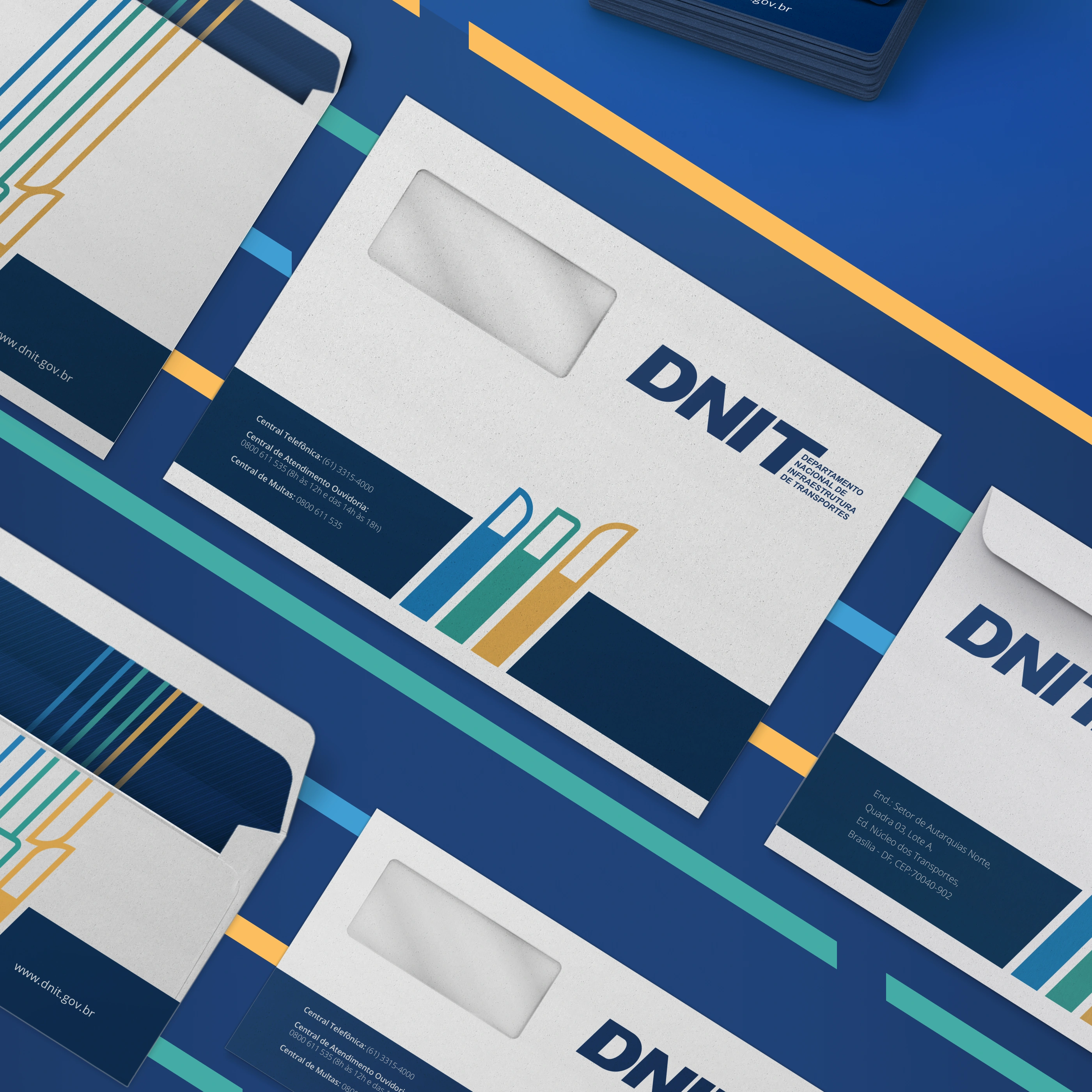
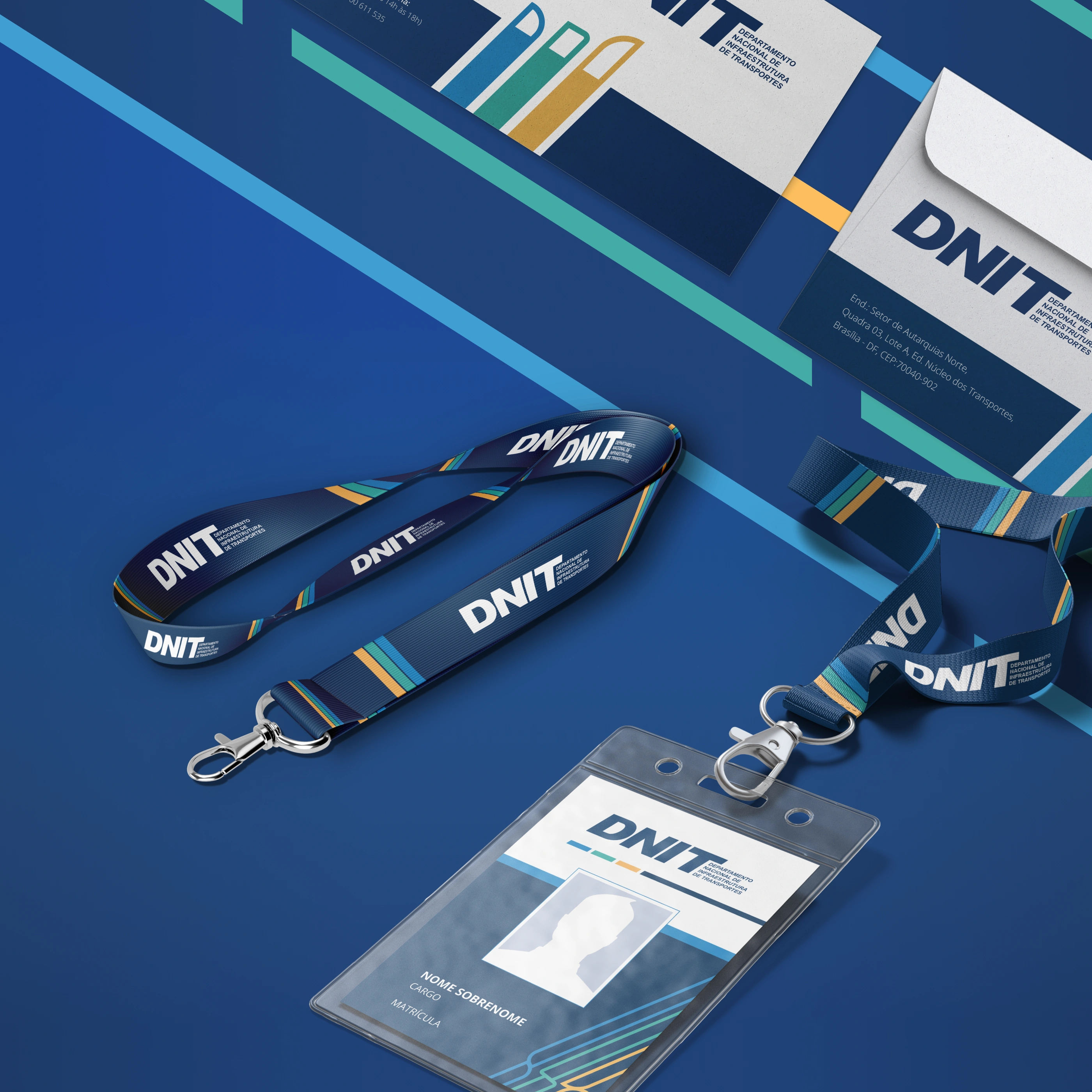
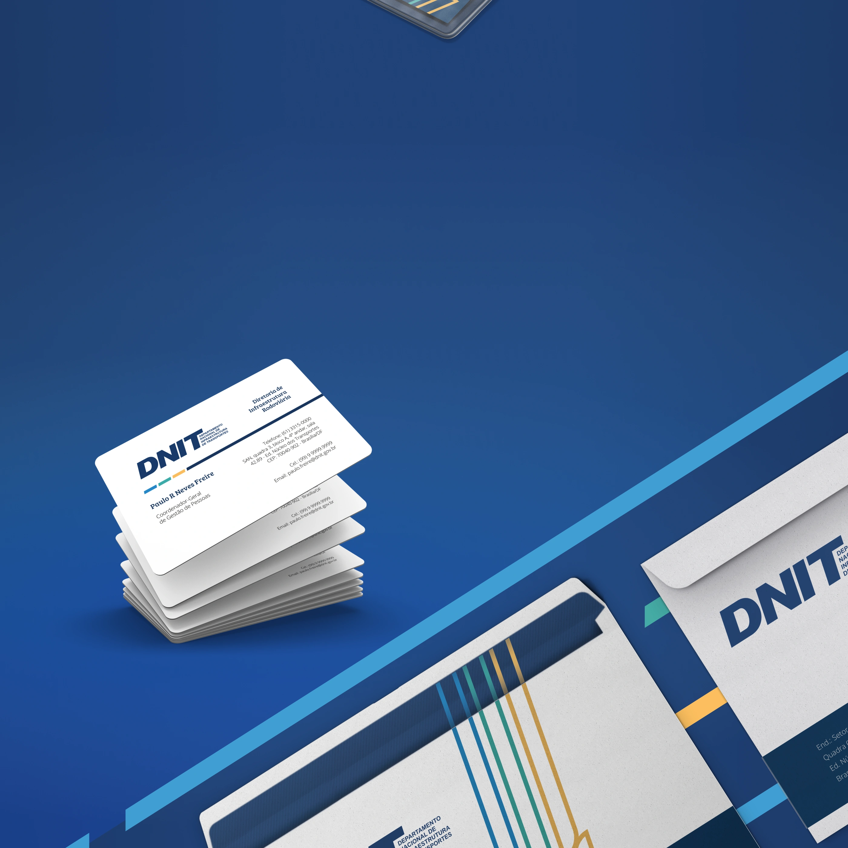 EXPAND IN A FLUID, BUT SYSTEMATICALLY ORGANIZED WAY, CARRYING THE VALUES OF THE AUTARCHY IN A SUBTLE AND HARMONIOUS
REPRESENTATION THAT COULD CONVEY AN IDENTITY WITH THE BRAND'S PERSONALITY
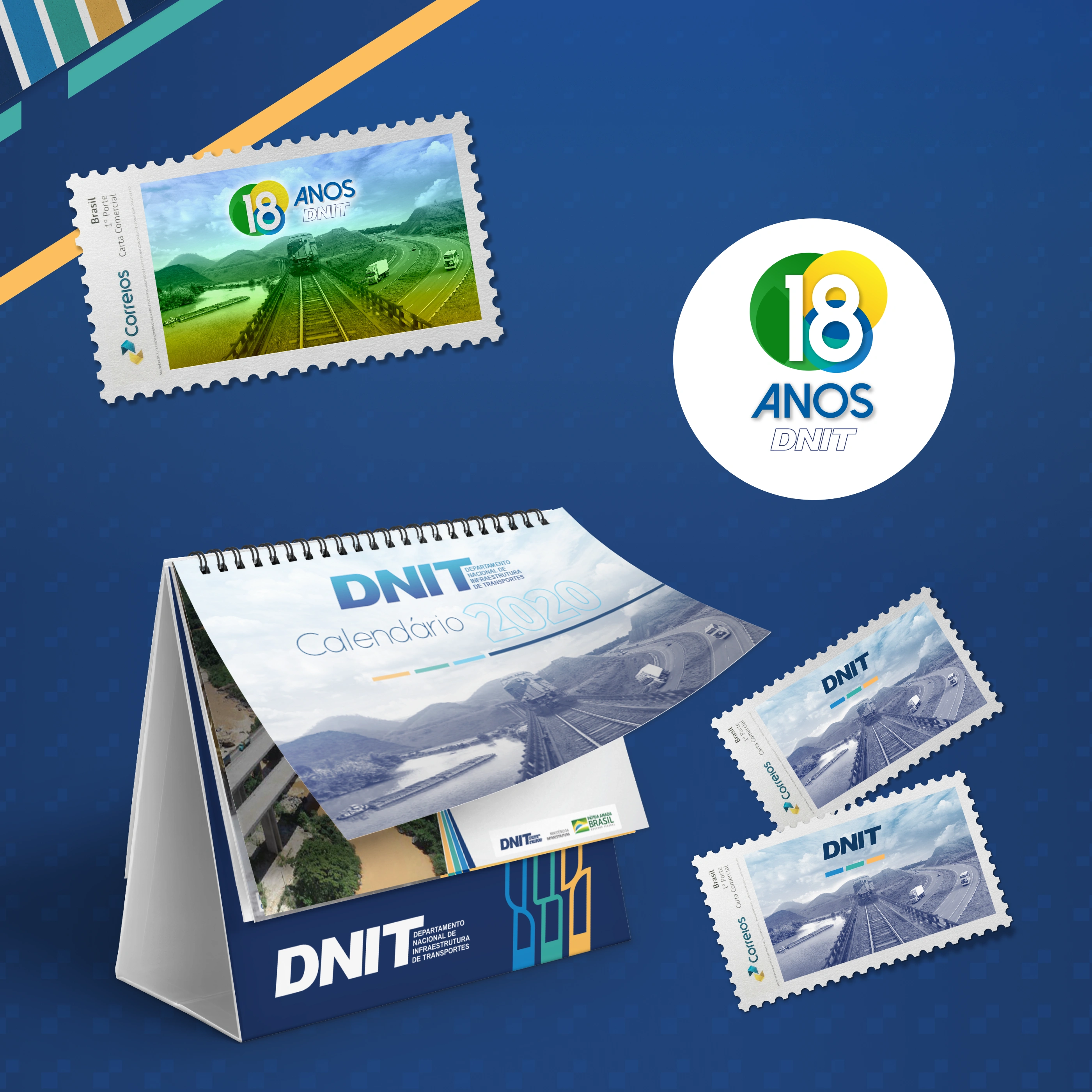 STAMP IN COMMEMORATION OF THE 18TH ANNIVERSARY OF THE AUTARCHY
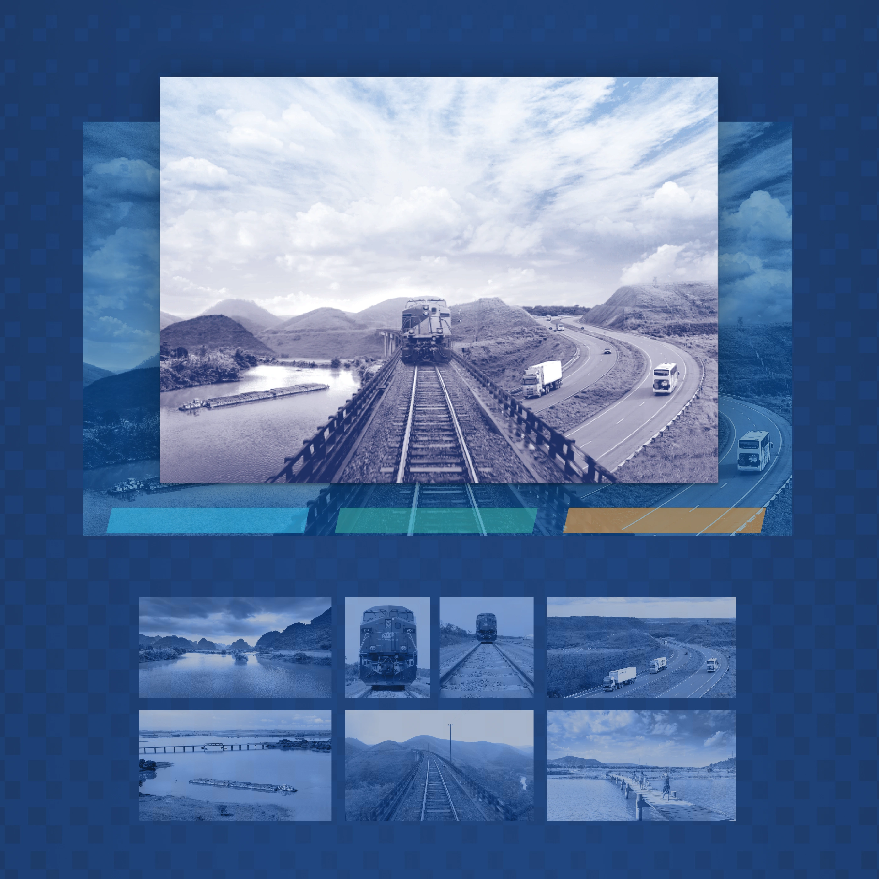
 FROM THE NECESSITY OF AN IMAGE THAT COULD REPRESENT THE MODES OF TRANSPORT, ROAD, RAIL, AND
WATERWAY IN A SINGLE COMPOSITION, THIS IMAGE WAS DEVELOPED BY THE DESIGN TEAM TO FULFILL THIS
PURPOSE WITH IMAGE MANIPULATION TECHNIQUES.